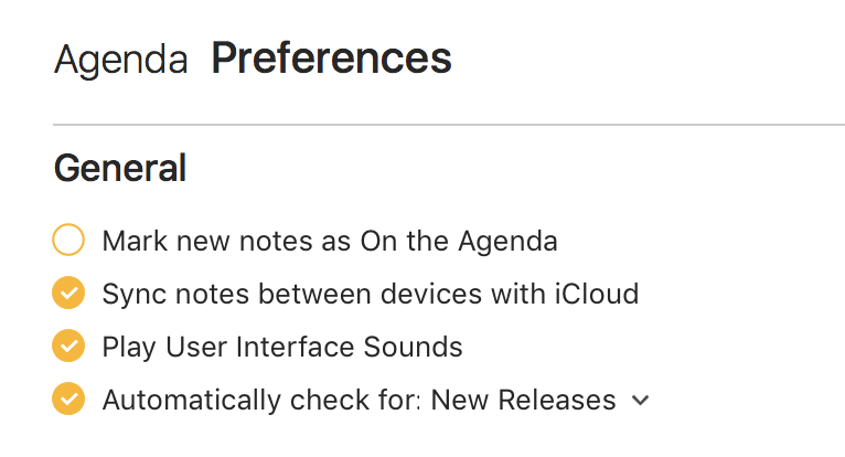
The control you use in the Preferences window to toggle options (under the General section, as an example) aren’t obviously controls. I incorrectly assumed for longer than a moment that these were simply a bulleted list of capabilities enabled by, say, my premium subscription.
It appears they’re the same custom “done” control used in notes but they’re simply not “activating” on mouse over to show they’re interactive and checked.
My suggestion is either to leave their appearance “always active” in the preferences window or to use a different style altogether. I prefer the latter as this custom control suggests “doneness” of a task everywhere else in your UI and should be reserved for this idea only. A control that suggests a setting or an option should be visually distinct.
As your app uses a lot of custom controls, I’d imagine this as a flat round-rect outline with either a check/tick or filled in almost to border as your “done” controls, but should always appear like that control’s “active” state. That is, the round-rect outline should always be visible and, when “selected”, there should be a clear border and an inset fill.
I think this simple change would not only avoid the confusion I felt in the Preferences window, but communicate through visual distinction the difference between a completed item and an option.